 Yessssss….My Preciousssssss…
Can you imagine Golum as a Project Manager? Instead of a ring, though, he’d be clutching a printout of the latest status report with his favorite chart. It’s funny to picture. But I must admit: I’m starting to see the attraction.
My Favorite Chart
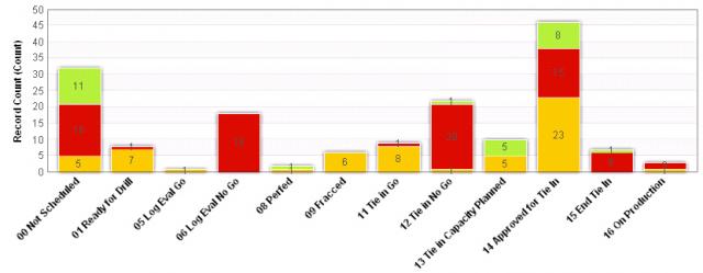
I just returned from the Second Annual Workfront User Conference. It was my privilege to speak for the second time. My presentation this year was “Four Webthings and a Funeral” (NOTE: this is a BIG file), where I shared four of the most important configurations we’d made to our Project Management Software. The first was a chart called the Big Picture. It helped all our team members visualize the progress of our Projects — Drilling Gas Wells, in our case — as they moved from left to right through the various Phases of work. Here’s an example:
The Big Picture
The main reasons that this chart is “Precious” to me are that it is:
- Intuitive: in the beginning, all Projects were stacked on the left, and at the end, they’ll all be on the right
- Scalable: no matter how many Projects there are, the Y-Axis will adjust to accommodate
- Adaptable: the Phases can be redefined to suit any industry
- Data Driven: as Project Based Work progresses, the underlying data drives each Project into the appropriate Phase
- Informative: grouping Projects by their overall schedule status (Red = Late, Yellow = At Risk, Green = On Track) helps qualify the progress and spot trends over time
- Functional: in Workfront, users can simply click a section of the chart to drill down into the underlying Projects
Ring of Truth?
One of the promises of On-Demand Project Management is to give everyone a common vision of what’s going on. If you have a standard process that can be represented as an assembly line, I hope you’ll consider adopting a Big Picture such as the one shown above. And if you don’t, perhaps you can forge another to bind your team together.
